This case study focuses on redesigning the current iOS Liquid Glass buttons to be more accessible and readable, particularly for users with visual impairments.
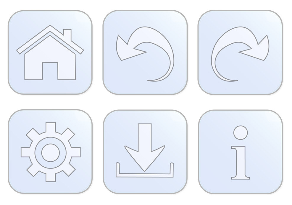
I chose not to blur the background, maintaining the visibility of background images for users who prefer them. I simplified the icons for clarity at small sizes and used a frosted white color to keep them opaque over images. To ensure visibility on light backgrounds, I added a black stroke around each icon.
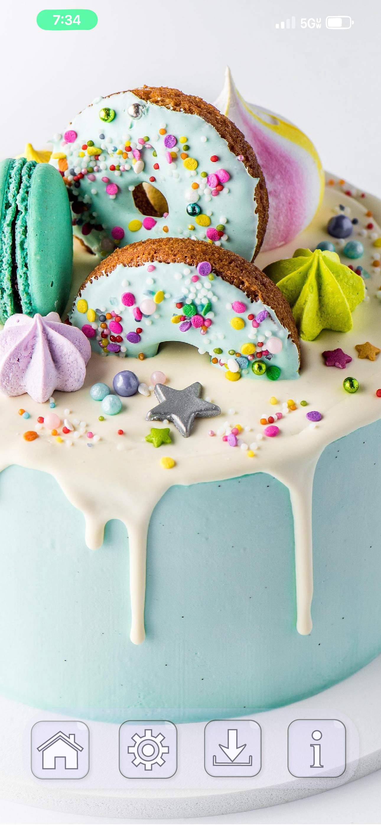
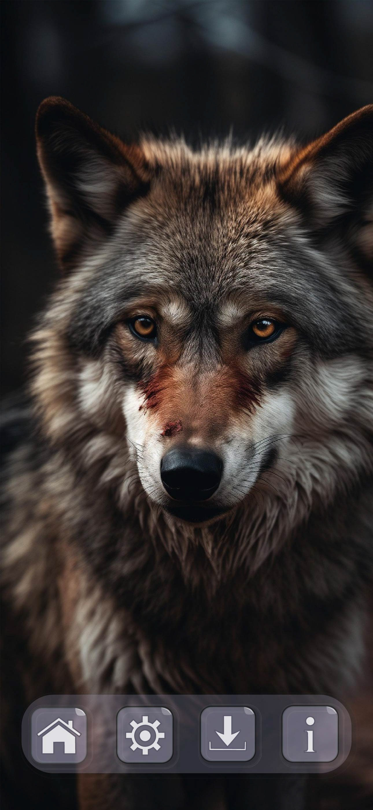
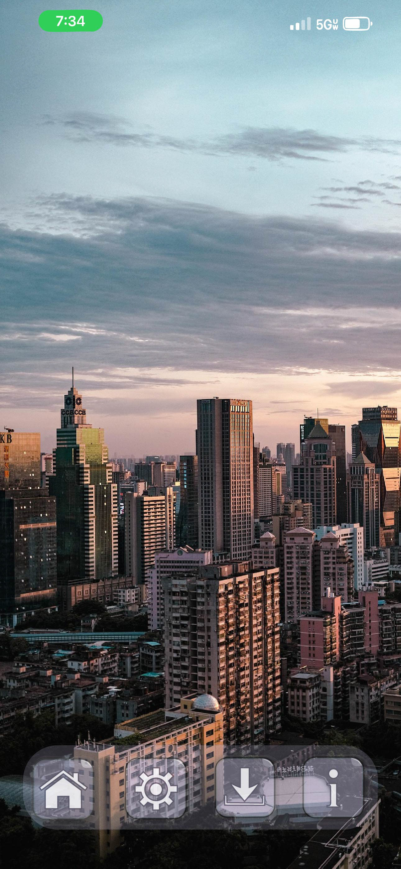
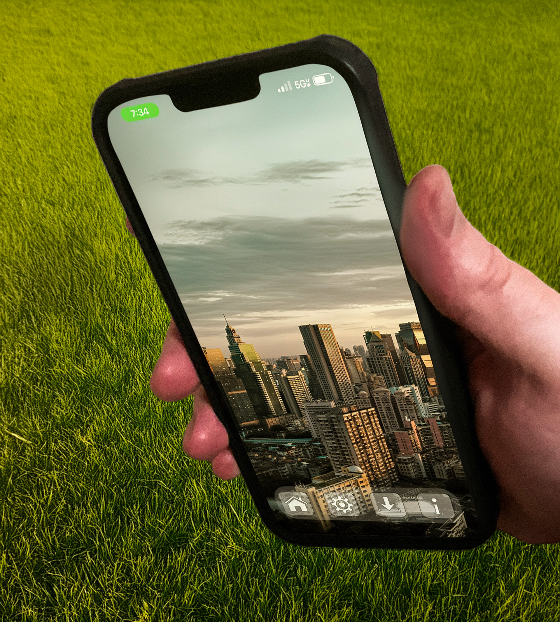
What the buttons look like on my iPhone 13 Pro Max.
The final design offers a more robust and accessible user experience without sacrificing the clean, modern aesthetic of iOS.